Siemens SEND Digital Twin
Client
- Siemens
Deliverables
- Augmented reality interface
- Digital twin campus
- At-a-glance data
An ambitious energy efficiency project
Siemens Smart Energy Network Demonstrator is a live project showing how technology can bring greater energy efficiency to Keele University. They plan for future deployment at larger scales, if successful. Siemens is deploying innovative technologies to save money, minimise environmental impact and better distribute energy across the campus. Their aim is to improve environmental and efficiency credentials without impacting the comfort, convenience or usability of any of Keele’s resources.
The experts at Siemens all have a good grasp of energy data – it’s what they do. Many people, however, including decision-makers, don’t have the same innate understanding. Siemens needed a middle ground – a way to communicate, quickly and easily, that the SEND project was making a huge difference.
That’s where we came in. Alongside our Triangulum energy flow animation, we built Siemens a smart, data-driven AR campus experience.
"MAADIGITAL has created a uniquely easy-to-use digital twin that helps us show the positive effects of the Keele University SEND project in augmented reality to a wide range of people. Brilliant!"
Ian Lloyd, Head of Microgrid Solutions, Siemens plc.

Building Keele with drones
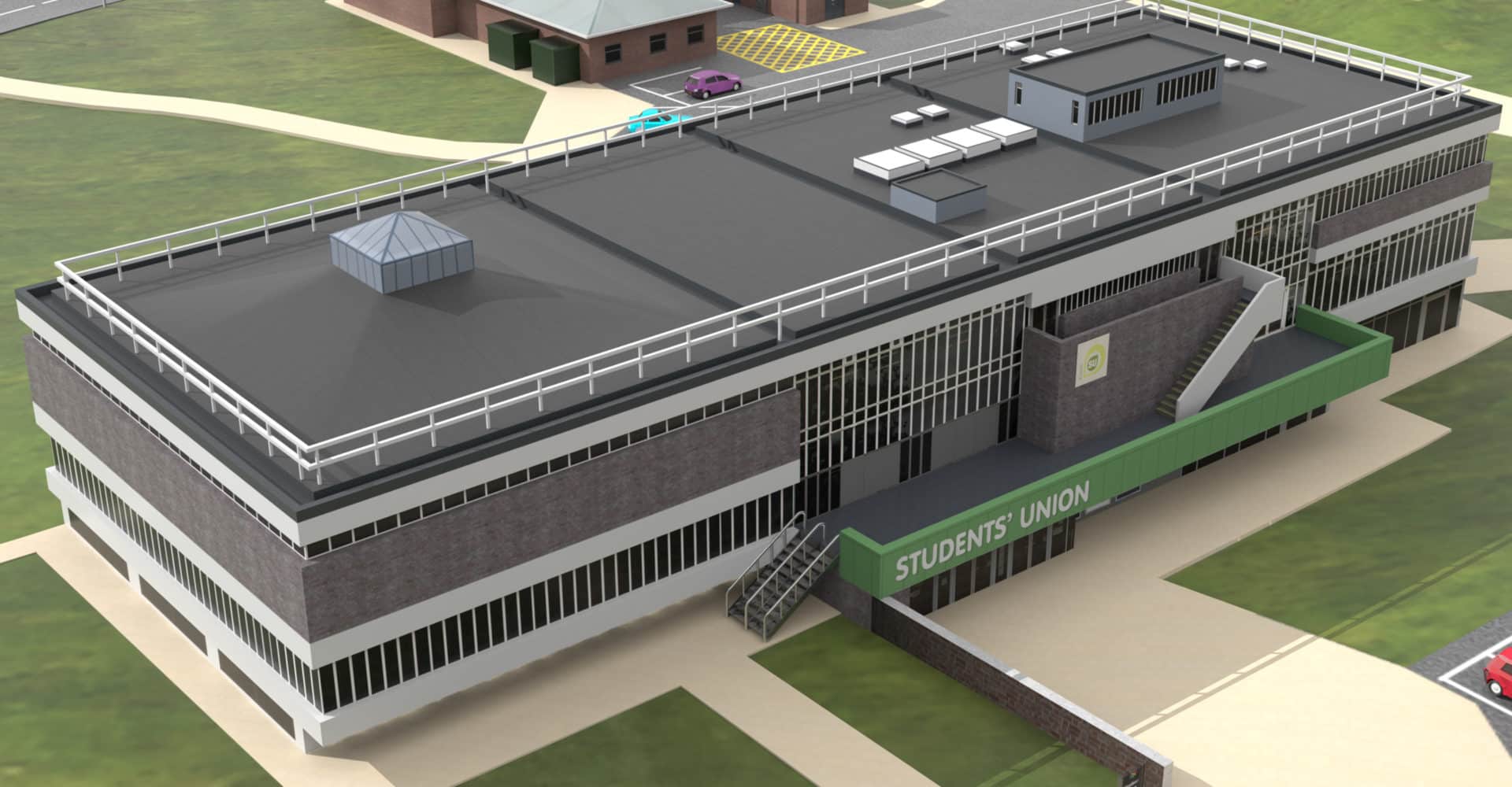
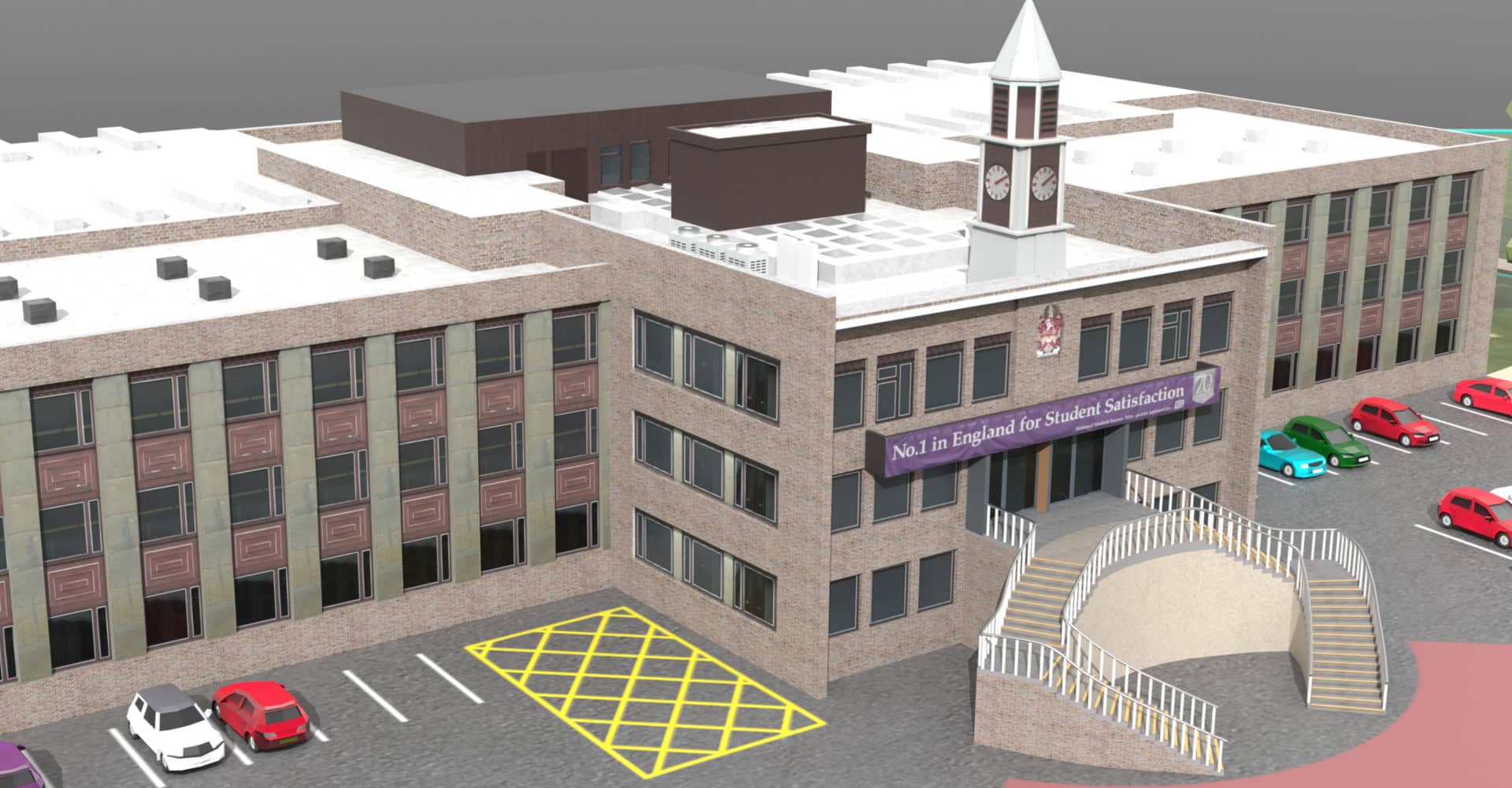
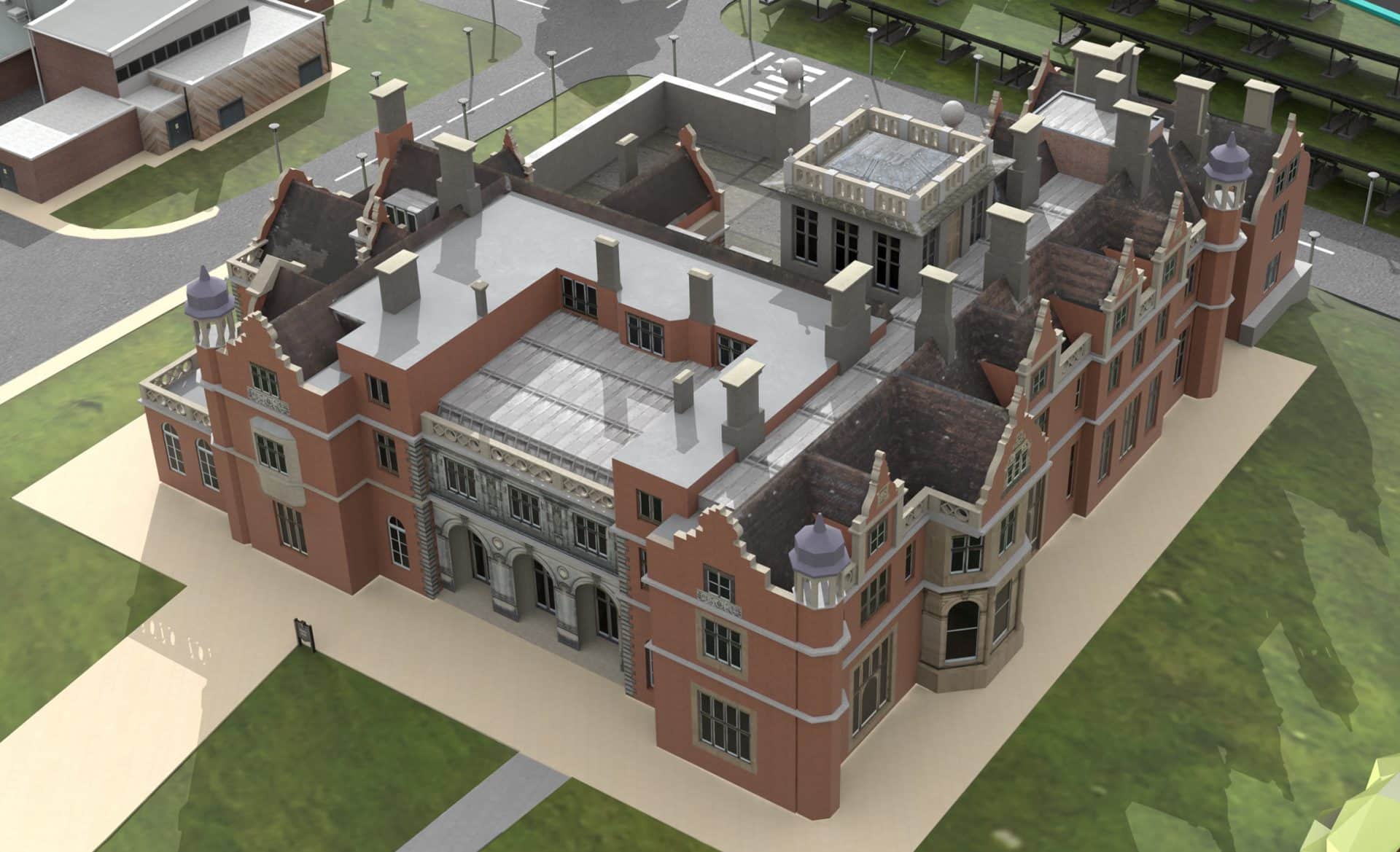
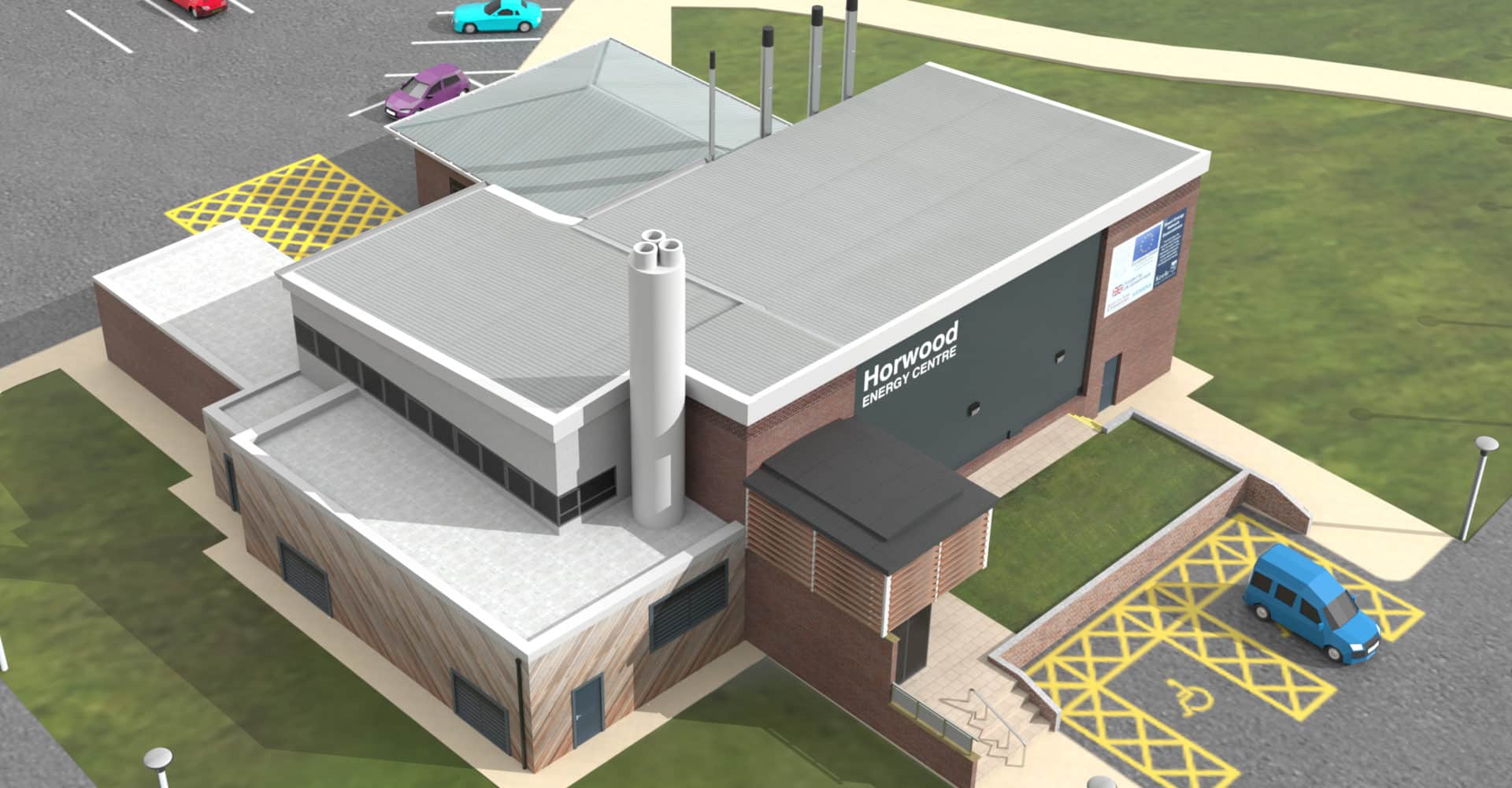
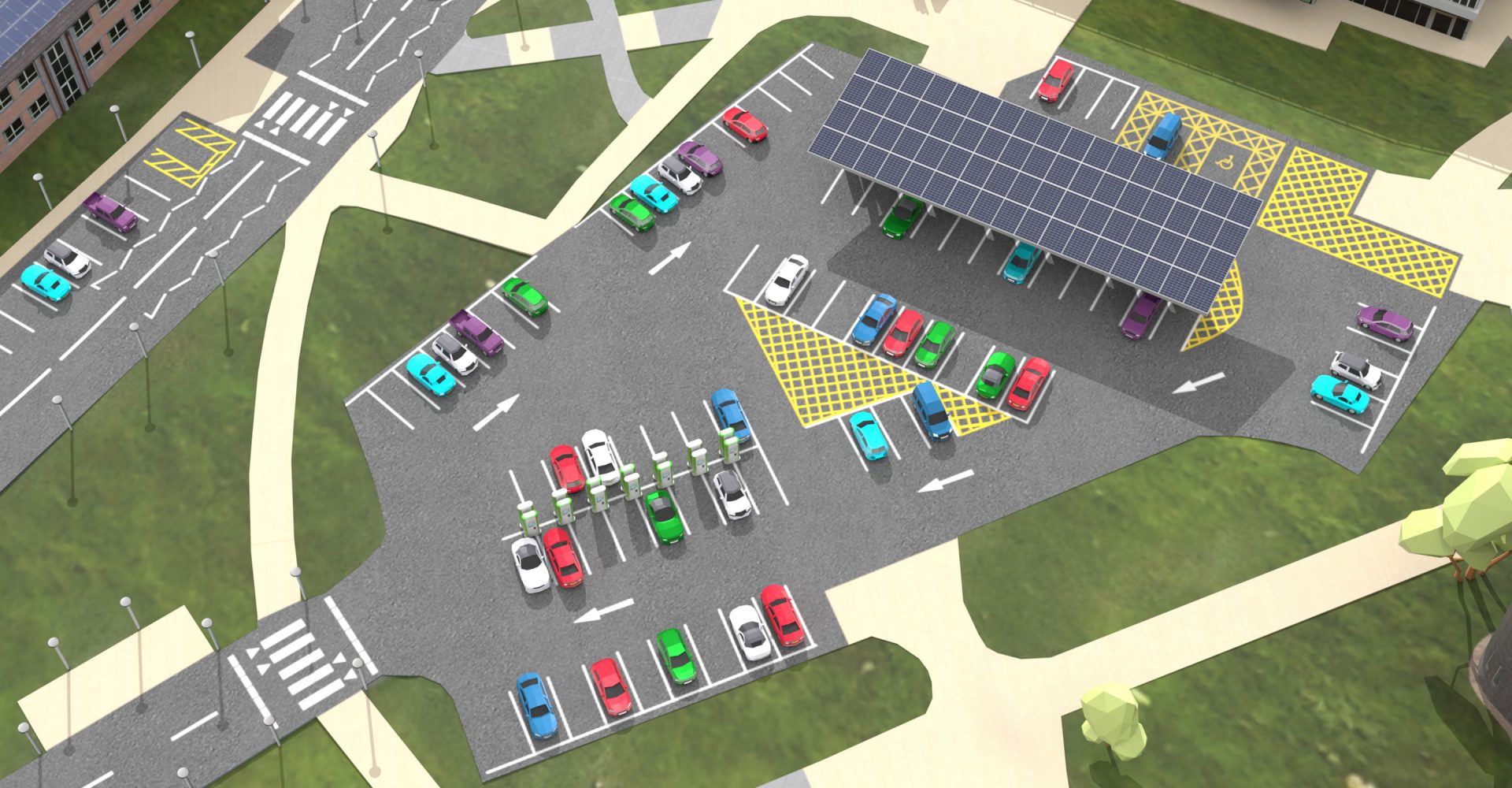
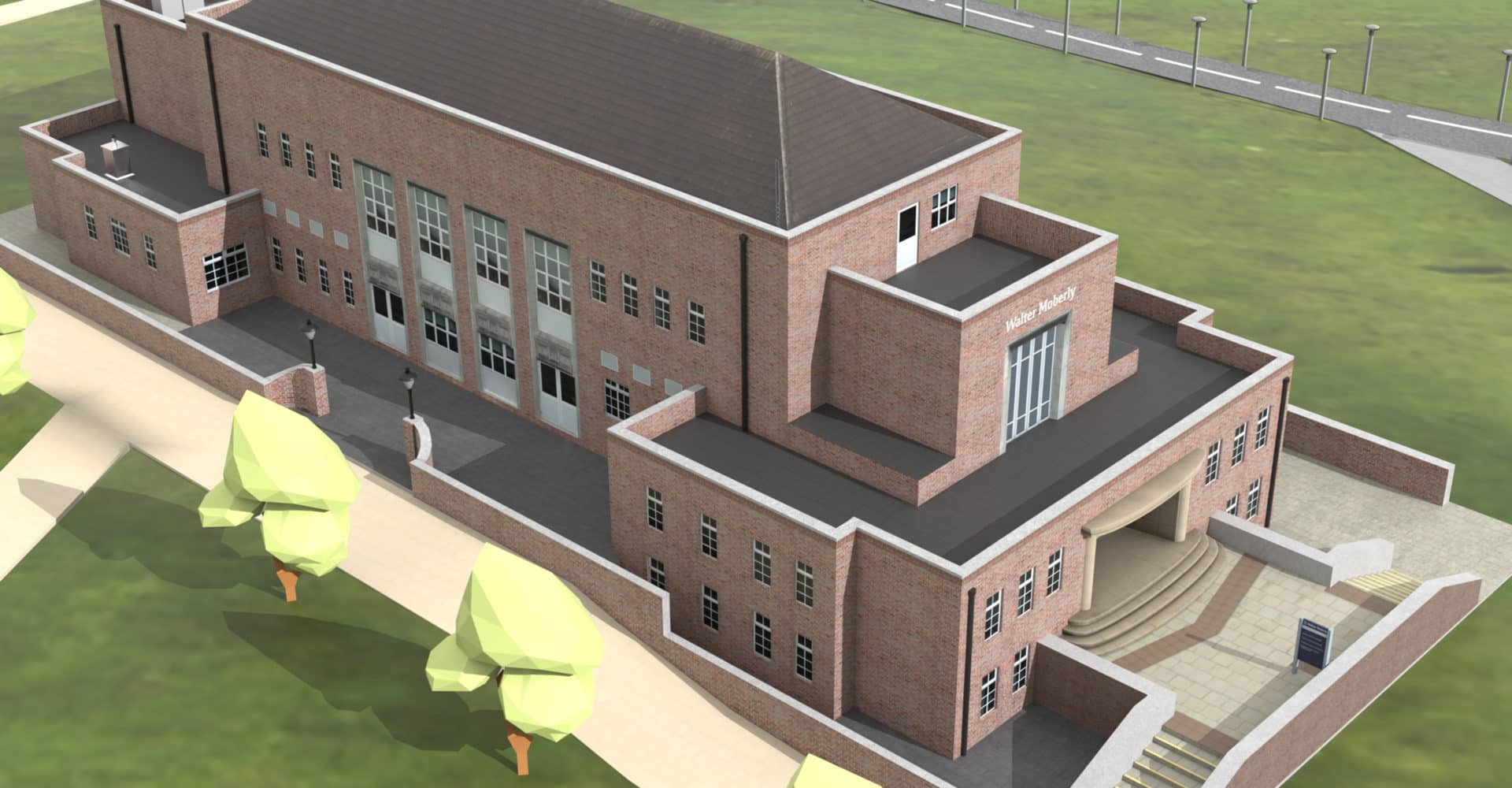
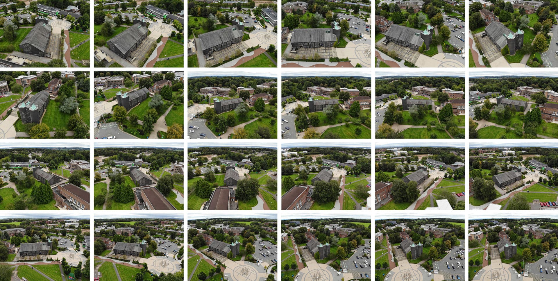
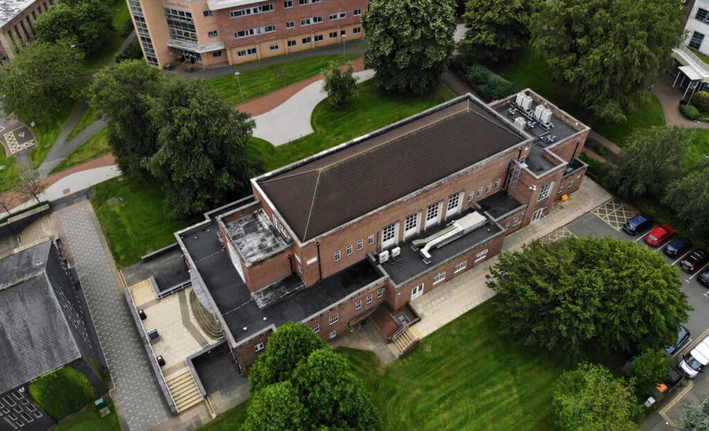
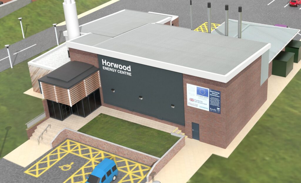
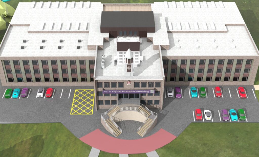
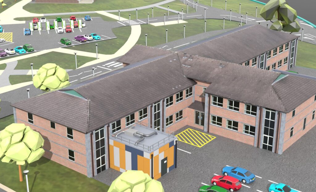
To build pixel-perfect digital twins of Keele University’s SEND-equipped buildings, the project called for clear, 360-degree visual information of each structure.
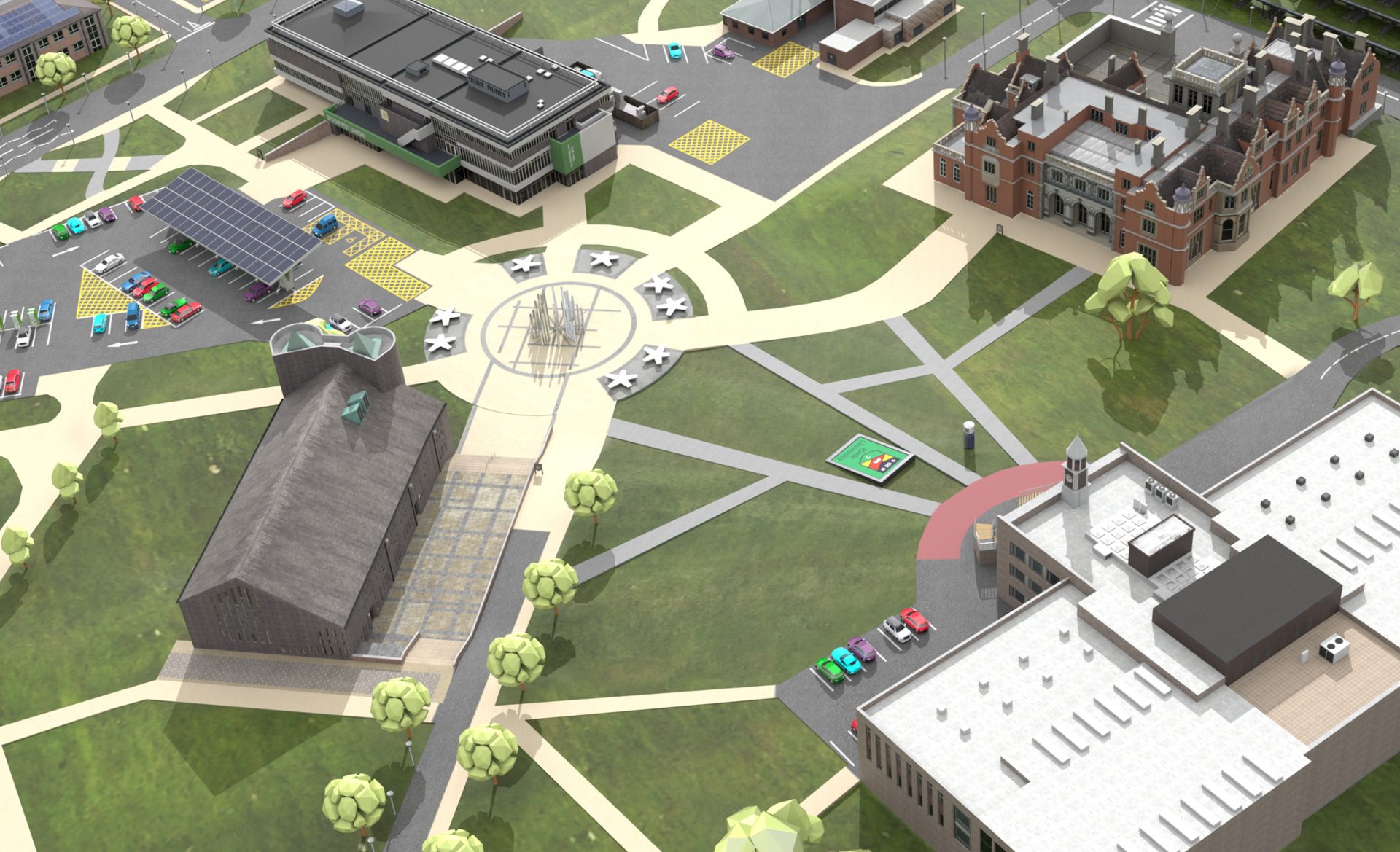
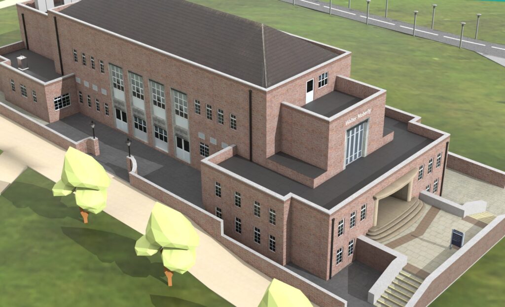
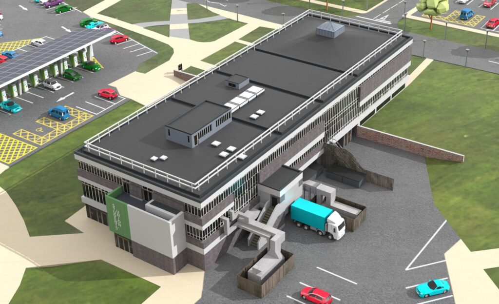
Working alongside specialist drone camera operators, we captured thousands of photos from dozens of angles and elevations, building up a detailed picture of each building. Using specialised 3D software, we reconstructed seven core buildings, ready to be loaded into our custom-built 3D environment.
- 5000 drone photos captured
- Over 1,000,000 polygons optimised
- Seven buildings reconstructed

An intuitive augmented reality energy demonstration tool
Using cutting-edge augmented reality, and smart data visualisation, we created an impactful experience packed with easy-to-digest, glance-able information, accessible to anyone.
With a focus on how the SEND project is growing over time, we incorporated efficiency maps and timing functions to give greater depth to the data.
- Powerfully intuitive user interface
- Multiple layers of data


Complex data, demystified
Different users are interested in different levels of data. To be able to serve information to as many users as possible, we created a multi-layered data experience.
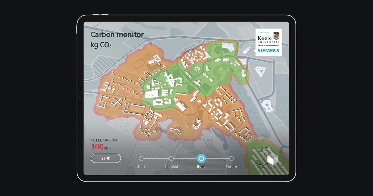
At a glance, a heatmap provides a sense of improvement in efficiency over time.
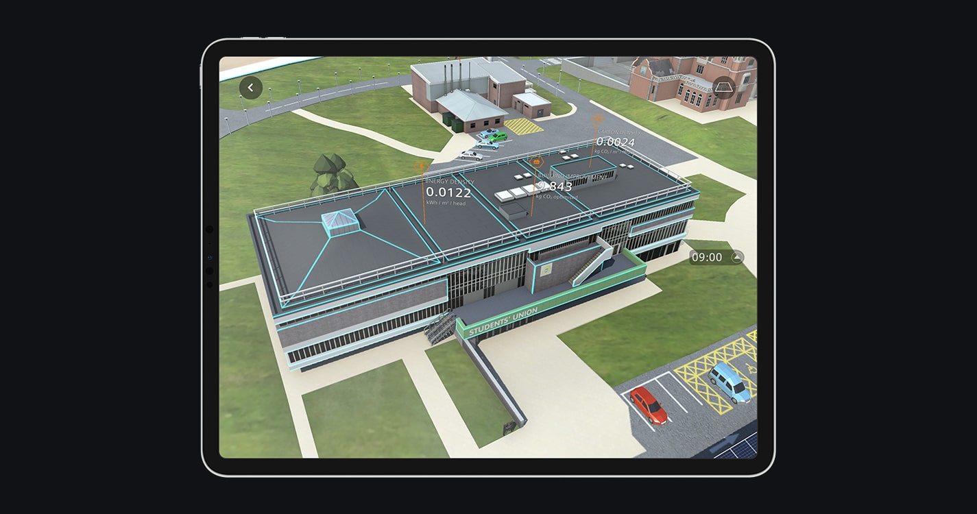
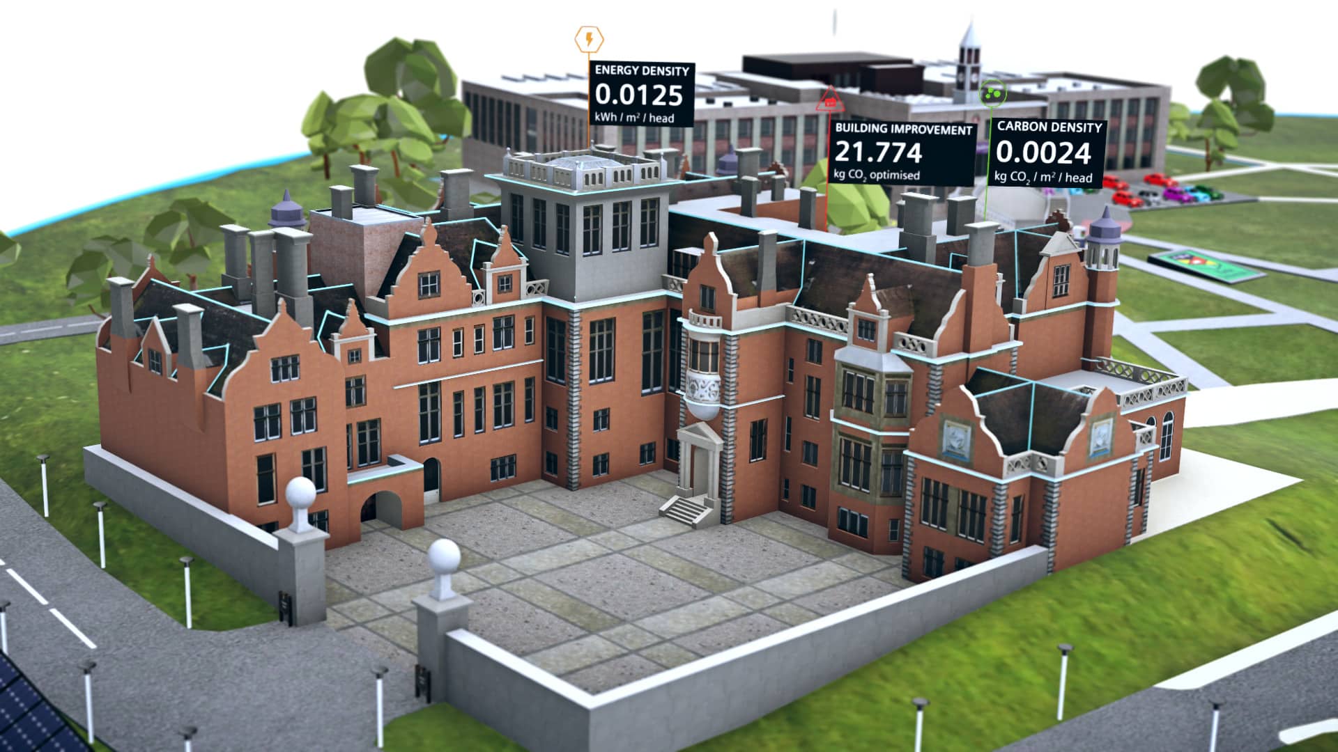
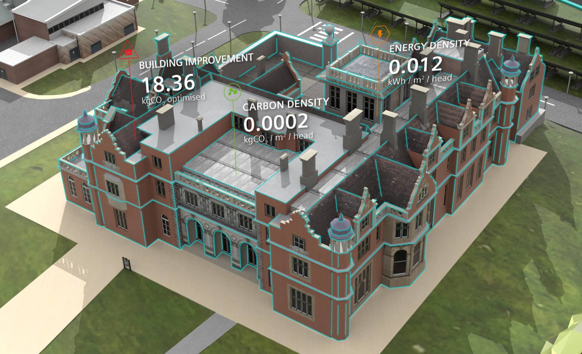
Within the AR experience, buildings in the digital twin of the campus display core data when looked at, with the ability to view data over the last 24 hours.
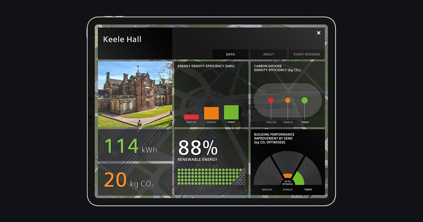
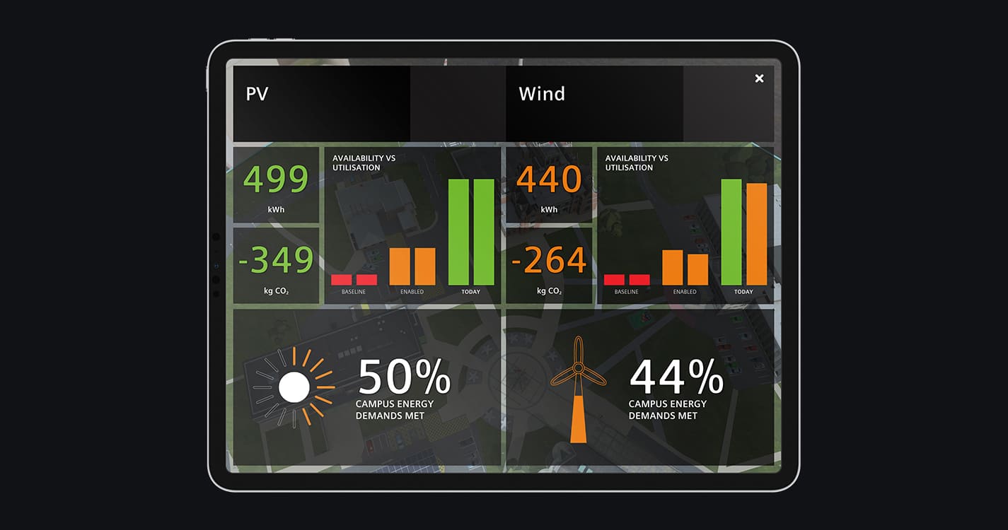
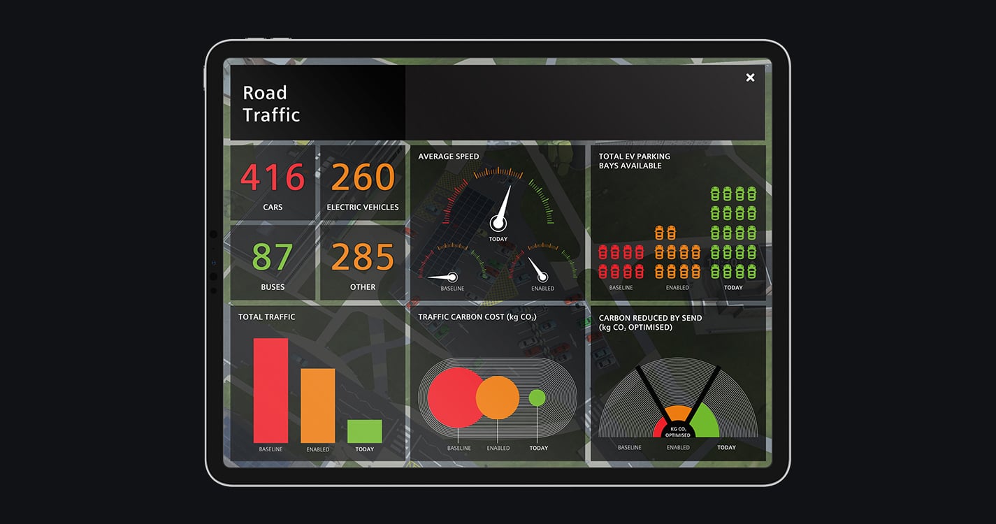
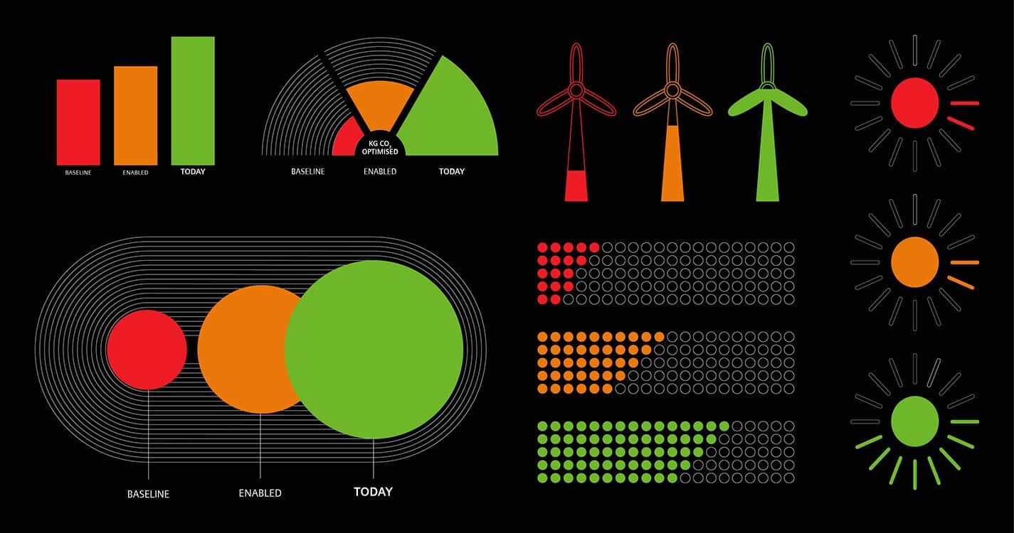
For full, in-depth improvement statistics, each building, the traffic, and renewable energy sources has a graphical dashboard with smart graphs displaying real-time data compared with set points in the SEND project.
- Full-campus efficiency improvement heatmap
- At-a-glance, real time data popups
- Comprehensive graph data dashboards
